Choosing a downlight is not only a matter of brightness. Color temperature changes how a room feels, how surfaces appear, and how comfortably people use the space.
The U.S. Department of Energy reports that LED lighting can use at least 75% less energy than incandescent lighting and may last up to 25 times longer. That efficiency matters, but performance depends on correct selection. The ENERGY STAR Lighting Facts label also emphasizes measurable details, including correlated color temperature (CCT), color rendering index (CRI), lumens, and wattage. These figures help compare products beyond attractive packaging.
This guide explains How to choose between warm and cool white downlights through seven practical tips. Warm white, commonly around 2700K–3000K, can make timber floors, fabric sofas, and restaurant seating appear softer. Cool white, often around 4000K–5000K, can provide a cleaner appearance for kitchens, offices, garages, and work areas. However, color temperature alone does not guarantee good visual quality. A low-CRI fitting may distort artwork, food, or skin tones, even when its CCT seems suitable.
The Illuminating Engineering Society recommends evaluating lighting according to the task, visual comfort, uniformity, and environment rather than relying on one specification. That advice is easy to overlook. In real installations, ceiling height, wall color, dimming behavior, beam angle, and daylight can change the result significantly. A 4000K downlight may look crisp in a white kitchen but harsh against dark wood. Personal preference also complicates the decision. There is no universal answer, and even careful planning sometimes needs a sample fitting before final installation.
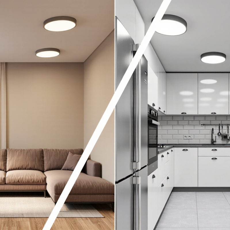
ANSI C78.377 provides a useful reference for organizing white light by chromaticity. For practical selection, warm white usually falls between 2700–3000 K. It creates a softer appearance for bedrooms, lounges, restaurants, and wood-finished interiors. Cool white commonly ranges from 5000–6500 K. It gives kitchens, workshops, garages, and retail areas a cleaner, sharper visual impression. Kelvin describes color appearance, not brightness.
Check the room’s purpose before choosing a downlight. Compare the proposed CCT with daylight entering through windows. A 6500 K fitting can look harsh beside warm evening lamps. A 2700 K fitting may make white tiles appear yellow. Examine wall paint, flooring, and furniture under the actual light. Small samples help. They also expose mistakes. I have found that online product images often hide green or blue shifts.
Review the datasheet carefully. Confirm the nominal CCT, color tolerance, CRI, beam angle, and dimming compatibility. ANSI C78.377 supports consistent chromaticity evaluation, but fixtures can still differ between batches. Use the same CCT throughout connected areas unless contrast is intentional. For mixed lighting, test the installation at daytime and nighttime. Do not choose cool white simply because it feels brighter. Glare, excessive blue content, and poor diffusion can reduce comfort. The best decision balances visual task needs, room finishes, and long-term viewing comfort.
Warm or Cool White Downlights? Match Downlight CCT to Room Use and IES Illuminance Targets
Tip 1: Start with the task, not the fixture. The IES Lighting Handbook sets illuminance targets by visual activity, rather than room labels alone. Tip 2: For reading, cooking, or detailed work, test 3500K–4000K with even distribution. EN 12464-1:2021 commonly uses 500 lux for office reading and writing areas. Brightness still needs control. Tip 3: For bedrooms and lounges, 2700K–3000K usually creates a calmer visual atmosphere. The U.S. Department of Energy describes these ranges as warm white in solid-state lighting guidance.
Tip 4: Match CCT to surface reflectance. Pale walls can make 4000K appear sharper, while dark finishes absorb light and reduce perceived brightness. Tip 5: Check the IES target at the working plane, not only below the downlight. A 500-lux reading target can fail when spacing, beam angle, or ceiling height is ignored. Use a light meter during a mock-up. Real rooms expose mistakes.
Tip 6: Consider time of use. A kitchen used early may benefit from 3500K, while a dining room can remain near 2700K. Tip 7: Keep adjacent spaces visually compatible. Sudden shifts from 3000K to 5000K can feel uncomfortable. The WELL Building Standard encourages lighting strategies that support visual comfort and occupant needs, but it does not prescribe one universal CCT. IES guidance is also not a substitute for on-site judgment. CCT alone cannot rescue poor glare control. Test, measure, and revise.
Choosing downlight color starts with the room’s purpose. Warm white, usually 2700K–3000K, softens bedrooms, lounges, and dining areas. It makes wood, beige fabrics, and skin tones feel more comfortable. Cool white, often 3500K–5000K, creates a clearer atmosphere for kitchens, bathrooms, offices, and work areas. However, very cool light can make a home feel sterile.
Check the CRI before comparing appearance. Choose CRI ≥80 for general residential lighting. Choose CRI ≥90 for color-critical residential spaces. This matters in kitchens, dressing rooms, art areas, and bathrooms with makeup mirrors. Higher CRI helps paint, food, clothing, and skin appear closer to their natural colors. Also inspect R9 performance when red tones matter. A high CRI number alone may not tell the whole story. That detail is easy to miss.
Test the light against your actual walls and flooring. Samples can look different beside white paint, dark stone, or natural timber. Use several downlights together, not one isolated fitting. Keep the color temperature consistent within connected spaces, unless the change is intentional. Check glare, beam angle, dimming stability, and color consistency between fittings. I once chose a warmer lamp for a small hallway, but the yellow wall became too strong. The better choice was slightly cooler light with accurate color rendering. Small mistakes happen. Recheck the room at night.
7 Tips How to Choose Warm or Cool White Downlights?
Choose colour temperature according to the room’s materials and use. Warm white, around 2700–3000K, softens timber and creates a relaxed bedroom atmosphere. Cool white, around 3500–4000K, makes worktops and white surfaces appear sharper. Do not judge colour alone. The Illuminating Engineering Society notes that perceived brightness also depends on contrast, surface reflectance, and distribution. Tip: View a sample beside your actual wall and flooring. A display-room test can mislead.
Compare lumens before wattage. A 900-lumen downlight may appear dim with a narrow, poorly aimed beam. The beam angle changes the spacing and brightness pattern. Narrow beams suit artwork or high ceilings; wider beams reduce dark patches across general areas. The U.S. Department of Energy’s 2023 Solid-State Lighting report identifies over 100 lm/W as a practical efficacy level for many modern LED systems. However, real fixtures lose output through optics, heat, and drivers. Look for tested lumens, not only LED-chip claims. Tip: Calculate useful light, not just box numbers.
Review LM-79 test data when available. This method measures total luminous output, colour, and electrical performance for complete luminaires. A reliable comparison includes delivered lumens, watts, beam angle, colour-rendering data, and lm/W. ENERGY STAR technical criteria have used minimum efficacy thresholds around 55 lm/W for certain downlight categories, so higher efficacy can reduce operating energy. Still, maximum efficacy is not always best. A slightly lower lm/W fixture may offer better glare control. I would recheck the target lux level after installation; reflections often change the result.
| Selection Factor | Warm White | Neutral White | Cool White | Practical Choosing Tip |
|---|---|---|---|---|
| Typical correlated color temperature (CCT) | 2,700–3,000 K | 3,500–4,000 K | 4,000–5,000 K | Select CCT according to the desired atmosphere, finishes, and task requirements. |
| Visual character | Soft, cozy, and slightly amber | Balanced and natural-looking | Crisp, bright, and slightly bluish | Warm light generally suits relaxing spaces; cooler light can support visual alertness. |
| Common applications | Bedrooms, living rooms, restaurants, hospitality areas | Kitchens, offices, corridors, retail areas | Utility rooms, workshops, healthcare and detailed task areas | Use the room’s function as the primary guide rather than choosing by color temperature alone. |
| Typical efficacy of an integrated LED downlight | Approximately 70–105 lm/W | Approximately 75–110 lm/W | Approximately 75–115 lm/W | Compare delivered fixture lumens divided by fixture watts; do not rely only on LED chip efficacy. |
| Example output at 10 W input | About 700–1,050 lm | About 750–1,100 lm | About 750–1,150 lm | Use the manufacturer’s tested output at the chosen CCT; output can vary with optics, heat, driver, and diffuser. |
| Color rendering recommendation | CRI 90+ is preferred for skin tones, wood, and warm finishes | CRI 80+ is suitable for general areas; CRI 90+ improves material appearance | CRI 80+ for general tasks; CRI 90+ for color-critical work | CRI indicates color rendering, not brightness. Check R9 when strong reds and skin tones matter. |
| Recommended beam angle | 24°–40° for accents; 45°–60° for general ambient light | 36°–60° for balanced task and ambient lighting | 40°–60° for broad, uniform task illumination | Narrow beams create stronger highlights; wider beams reduce scalloping and cover more floor area. |
| Beam angle and spacing | Approximate spacing: 1.0–1.5 times mounting height for 36°–60° beams | Approximate spacing: 1.0–1.5 times mounting height for general lighting | Approximate spacing: 1.0–1.4 times mounting height for uniform task lighting | Treat these as starting points; confirm spacing with a photometric layout and target illuminance. |
| Glare consideration | Lower CCT may feel comfortable, but glare still depends on luminance and shielding | Choose deep-set optics, a baffle, or a diffuser where screens are present | High brightness can appear harsh if the source is exposed | Check UGR, shielding angle, cut-off angle, and visible LED luminance when glare control is important. |
| Best overall choice | Comfort and ambience | Versatility and visual balance | Clarity and task visibility | For mixed-use interiors, 3,000–4,000 K with CRI 90+ and a 36°–60° beam is often a practical starting point. |
Warm white, around 2700–3000K, creates a relaxed atmosphere in bedrooms and lounges. Cool white, around 3500–4000K, can support visual tasks in kitchens, offices, and workshops. Test samples beside your walls and flooring. Digital images can mislead.
Confirm that the downlight works with your chosen dimmer and control system. Ask for its minimum dimming level. Some lights dim smoothly at 20%, but become unstable below 10%. That matters in bedrooms. I have seen a “dimmable” product pulse after installation, even when the paperwork looked acceptable.
Deep-set optics, suitable beam angles, and proper positioning can reduce harsh reflections on screens and polished surfaces. Request photometric data, including glare information where available. Flicker should be assessed using recognised measures such as PstLM and SVM. A camera test is useful, but it is not a laboratory result.
This standard evaluates risks from optical radiation, including blue-light exposure. Look for a test report, product scope, and stated risk group. Do not rely on a safety logo alone. Installation height, viewing angle, and direct exposure still influence comfort. Professional advice is worthwhile when lights are used near children, patients, or reflective work surfaces.
CCT describes light color, not brightness. Warm white usually ranges from 2700–3000 K. Cool white can range from 3500–6500 K.
Warm white usually creates a softer, calmer appearance. It works well with wood, beige fabrics, and evening relaxation. Test it against yellow walls.
Neutral or cool white can make kitchens, offices, bathrooms, and workshops look clearer. Very cool light may feel sterile. That matters at home.
Usually, yes. Consistent CCT reduces visible color changes between spaces. Intentional contrast can work, but test it during daytime and nighttime.
Choose CRI 80 or higher for general residential lighting. Choose CRI 90 or higher for kitchens, dressing rooms, art areas, and makeup mirrors.
R9 helps show how accurately red tones appear. It matters for food, clothing, skin, and artwork. A high CRI number may still hide weaknesses.
Confirm compatibility with the dimmer and control system. Ask for the minimum stable dimming level. Some fittings pulse below 10 percent.
Look for deep-set optics, suitable beam angles, and good diffusion. Review PstLM and SVM data when available. A phone-camera test is only a rough clue.
Request photobiological safety documentation under IEC 62471. Check the product scope and risk group. Viewing angle, mounting height, and direct exposure still affect comfort.
Wall paint, flooring, tiles, and furniture change the perceived color. Compare several fittings, not one isolated light. Online images can hide green or blue shifts.
Choosing the right downlight starts with understanding color temperature and the atmosphere you want to create. This guide explains How to choose between warm and cool white downlights by using ANSI C78.377 classifications: warm white typically ranges from 2700–3000 K, while cool white generally falls between 5000–6500 K. Warm light suits bedrooms, living rooms, and dining areas, whereas cool light can support kitchens, workspaces, and task-focused environments. The selected CCT should also suit the room’s purpose and recommended IES illuminance targets.
Beyond color temperature, evaluate light quality and performance. Choose a CRI of at least 80 for general use, or 90 and above when accurate color appearance is important in residential spaces. Compare lumens, beam angles, and LED efficacy in lm/W to achieve suitable brightness and coverage. Finally, check dimming compatibility, glare control, flicker performance, and IEC 62471 photobiological safety compliance for comfortable and responsible lighting.

Diva Lights